

Adobe Sign is a secure digital signature service. You can easily send, sign, track, and manage the collection of signatures using a browser or mobile device.
problems
As time passes, our customers have more documents that are being sent and tracked through the app find it’s harder to use, and impossible to manage big volume of documents.
Overloaded with options & difficult to find information.
Doesn’t scale for Enterprise.
Actions are hard to find.
process
I started looking into problems that we were facing on the old UI and found that the old UI were overloaded with options & very difficult to find information. Then I looked into the analytic that we have been collected over the years and try to tackle these problems by using the data that we have.
After I had a pretty clear ideas I started creating wireframes and final design. I then did the prototype and paired up with another researcher to do user testing. I updated the design based on the results of user testing. I then worked closely with engineers to make sure the design was implemented correctly.
rolE
UX/UI Design

Analytic
Base on data that we have been collected over the years, I make sure the top four features and functions that users love the most are on the very top level and easy to find.
Waiting for Other (agreement type)
Completed (agreement type)
Search
Reminder action

Frameworks / Detail on all pages

overall / old & new design
Old design, with expandable navigation/menu on the left panel, made it very hard to find any agreements. Also right panel was always there made the page overloaded with information.
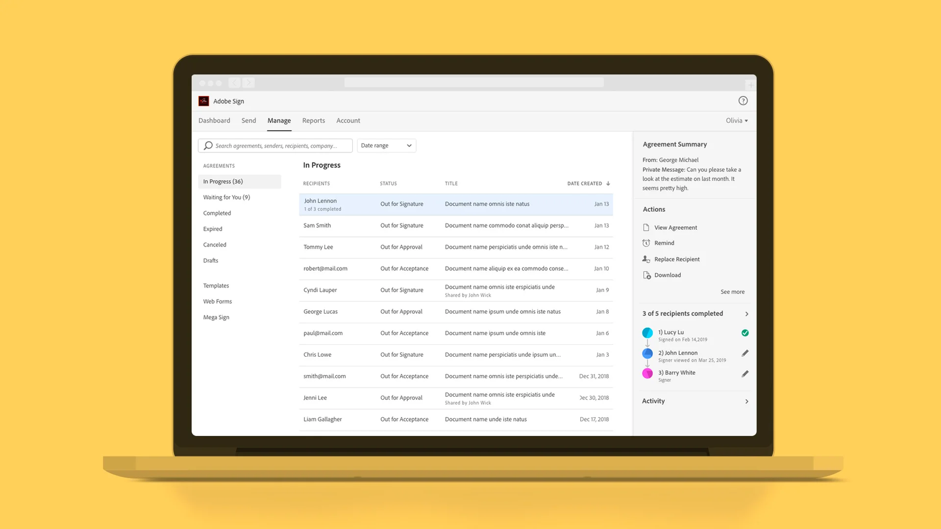
New design, no more expandable menu and less items of left panel/navigation. Right panel will show only when an agreement selected, all the information is there but will present to the users in the right moment when they need it. The new design is easier to navigate and have better organization of information.

Agreement categories & agreement list
Old design, there were 27 categories of agreement and these were expandable navigation that made it very hard to find any agreements. If there were more that 100 agreements on the first category, it push the rest of agreements down below the fold. Also there was only one table (Name, Company, Document Title and Date) for all these 27 status. This created even more confusion because each categories need different information on the table.
New design, there were only 9 instead of 27 categories. And I turned them into left navigation, make it easy to scale and doesn’t get too complicated like the old design. Also, each categories have different content in the table, make it clearer to understand.

Right panel
Old design, actions were in blue link, tab style and some were icons on the list on the table (left side). They were spread out. This panel is always stay on the UI, made the page overloaded with information.
New design, I reorganized information from the most important the least important based on the data from top-down. This panel won’t be on the default until users selected an agreement. All the information are on the page but will present to the users in the right moment when they need it.
I created this prototype to see how it works in realtime and use it for user testing.

What we learned from users.
Users prefer “search” over “filters”.
Users liked the easy-to-find categories on the left panel.
Users couldn’t easily tell the difference between center and right panel.
Applied what we learned.
Made Search more prominent and reduce filters from three to just one.
Better organized left panel/navigation, reduced from 27 to 9 categories.
Created depth on right panel, layered it with gray background and drop shadow.