
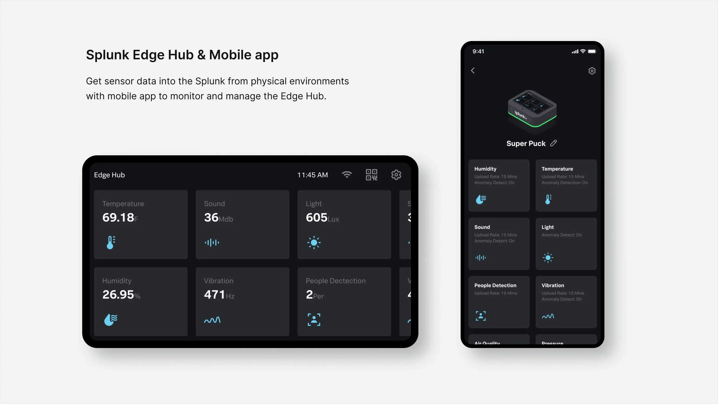
Splunk Edge Hub, the easiest way to aggregate, analyze, and get answers from your sensor data using edge AI.
Customers surveyed revealed 4 key insights
100% have concerns on what the full end-to-end experience is (too complex, too expensive, too long, too many components)
90% have issues with finding the right System Integrators (Partners)
75% have concerns with security
70% have concerns with platform orchestration
goals
Extend Splunk’s role as the end-to-end Platform
Use ARM based equipment to capitalize on distributed edge networks
Show the possible with ML/AI
rolE
UX/UI Design Lead

Exploring Existing Solution & mood board:
After understanding the problems users face and the goals we aim to achieve, I started my research and inspiration journey. This involved:
Competitive Analysis: I started looking into similar IoT products in the market, dissecting their strengths and weaknesses in terms of design, functionality, and user experience. This invaluable process allowed me to identify best practices, understand user expectations, and pinpoint areas for improvement.
Interaction Design Inspiration: I looked closely on user interactions with existing IoT products, paying attention to the user interface and interaction patterns. This provided me insights into usability, user flow, and potential design solutions.
Design Inspiration: I looked into online design communities like Dribbble, Behance, and Pinterest, for inspiration for visual elements like color palettes, typography styles, and overall aesthetics. This helped me visualize the product's visual and explore different design directions.

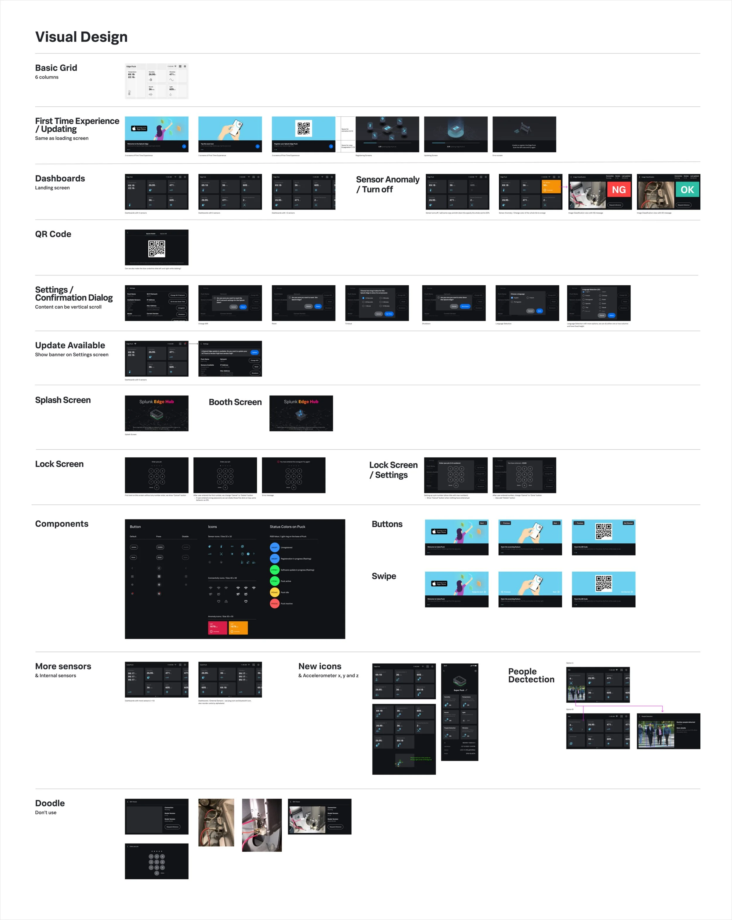
wireframe / iot device
Once I had an understanding of the research and inspiration findings, I moved to the wireframe stage. This involved:
Information Organization / Card Design: I organized all the information gathered from research, the existing solution, and the PRD. This included user flows, content elements, and functionality requirements. After sketching different ideas, I decided to use card design because it's easy to scale for more internal/external sensors in the future, and users can quickly see which sensor is on the card. This way, the information is very well organized.
Smooth User Flow Creation: I focused on creating a seamless and intuitive user flow. My main goal was to enable users to achieve their desired outcomes with minimal steps and effort. Based on feedback from engineers and PMs, I iterated on the flow, ensuring it was clear, logical, and optimized for efficient navigation.
Collaborative Refinement: I worked closely with my engineers and PMs, to review the wireframes. Their feedback allowed me to identify and address potential technical challenges and ensure the design was feasible and aligned with technical constraints.
adding color to the design
Leveraging the Existing Design System: As a foundation, I utilized our existing mobile design system, ensuring consistency and brand alignment across various platforms.
Tailored Design for the Device: I meticulously built upon the existing design system, meticulously adapting it to perfectly fit and complement the specific characteristics and functionalities of this unique IT device.
Iterative Refinement through Real-world Testing: To ensure optimal user experience, I tested the design on the actual device throughout the design process. This provided crucial insights into the visual aesthetics and interaction flow, allowing me to refine the design for a seamless and intuitive user experience.

Edge Hub screens
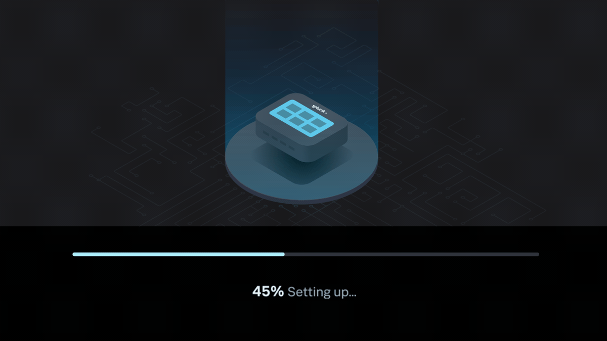
First time experience animation
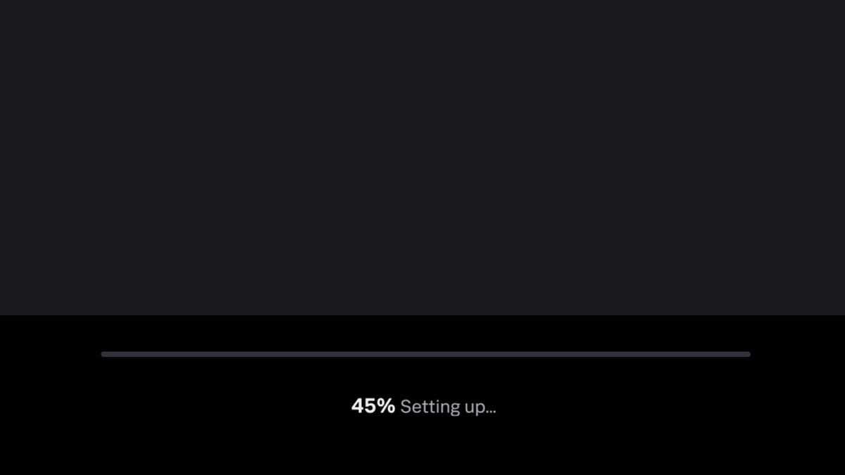
Loading animation
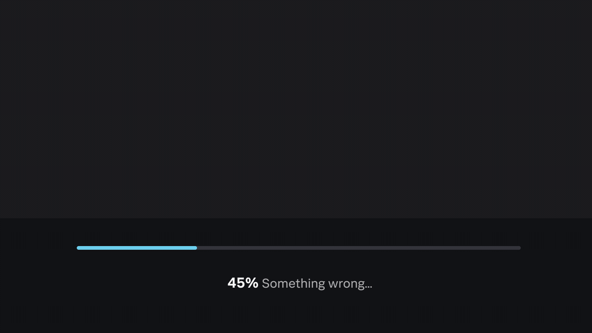
Error animation
Loading animation
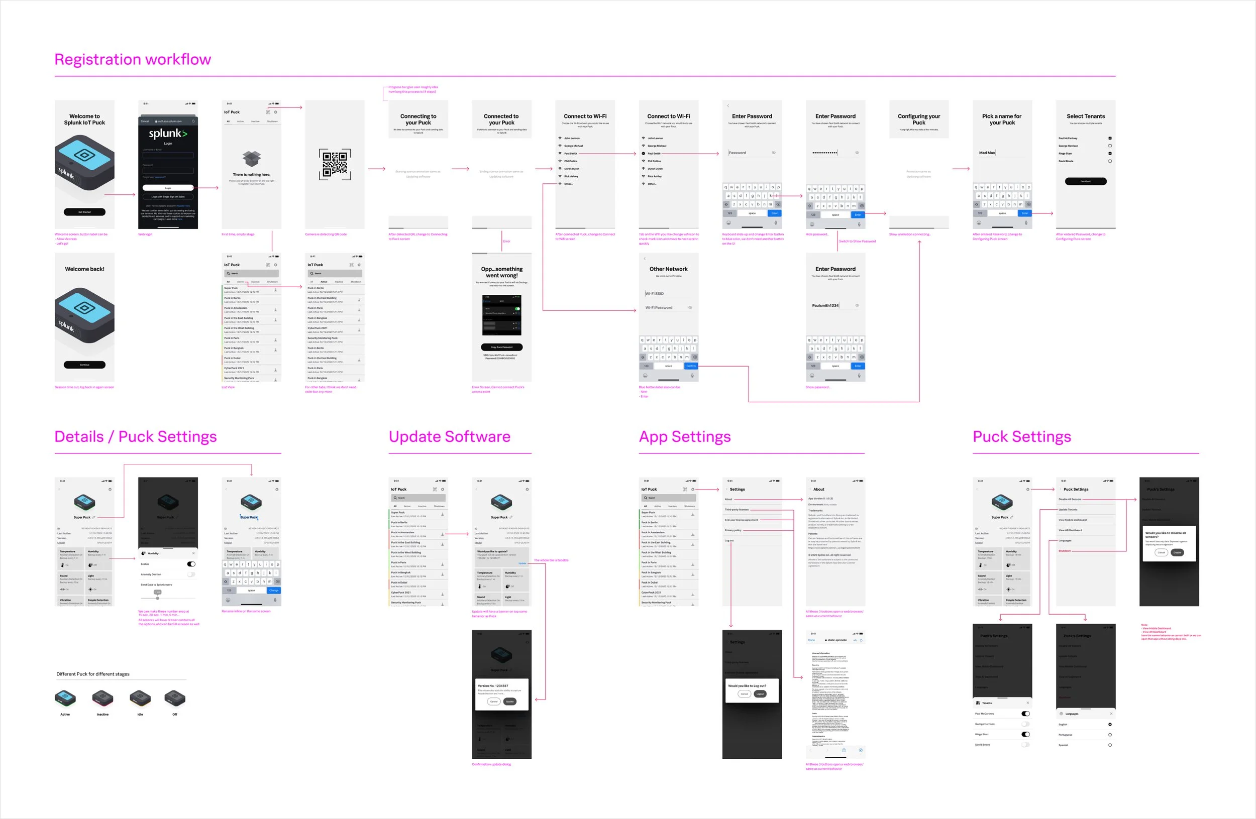
wireframe / mobile app
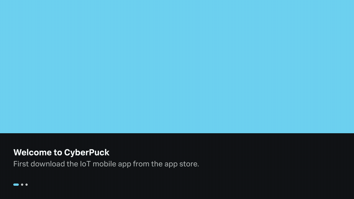
Super Clear and Smooth Pairing Experience: I designed the registration flow to be crystal clear and effortless. To ensure each step was intuitive, providing clear instructions and feedback, and minimizing user input to optimize the process.
User-Centric Design Approach: Every aspect of the registration flow was designed with the user in mind. I focused on minimizing cognitive load, using familiar interaction patterns, and providing visual cues to guide users through the process seamlessly.
Building User Trust and Confidence: The registration flow is a critical opportunity to build user trust and confidence. I incorporated progress indicators, error handling, and clear confirmation messages to ensure users feel secure and informed throughout the process.
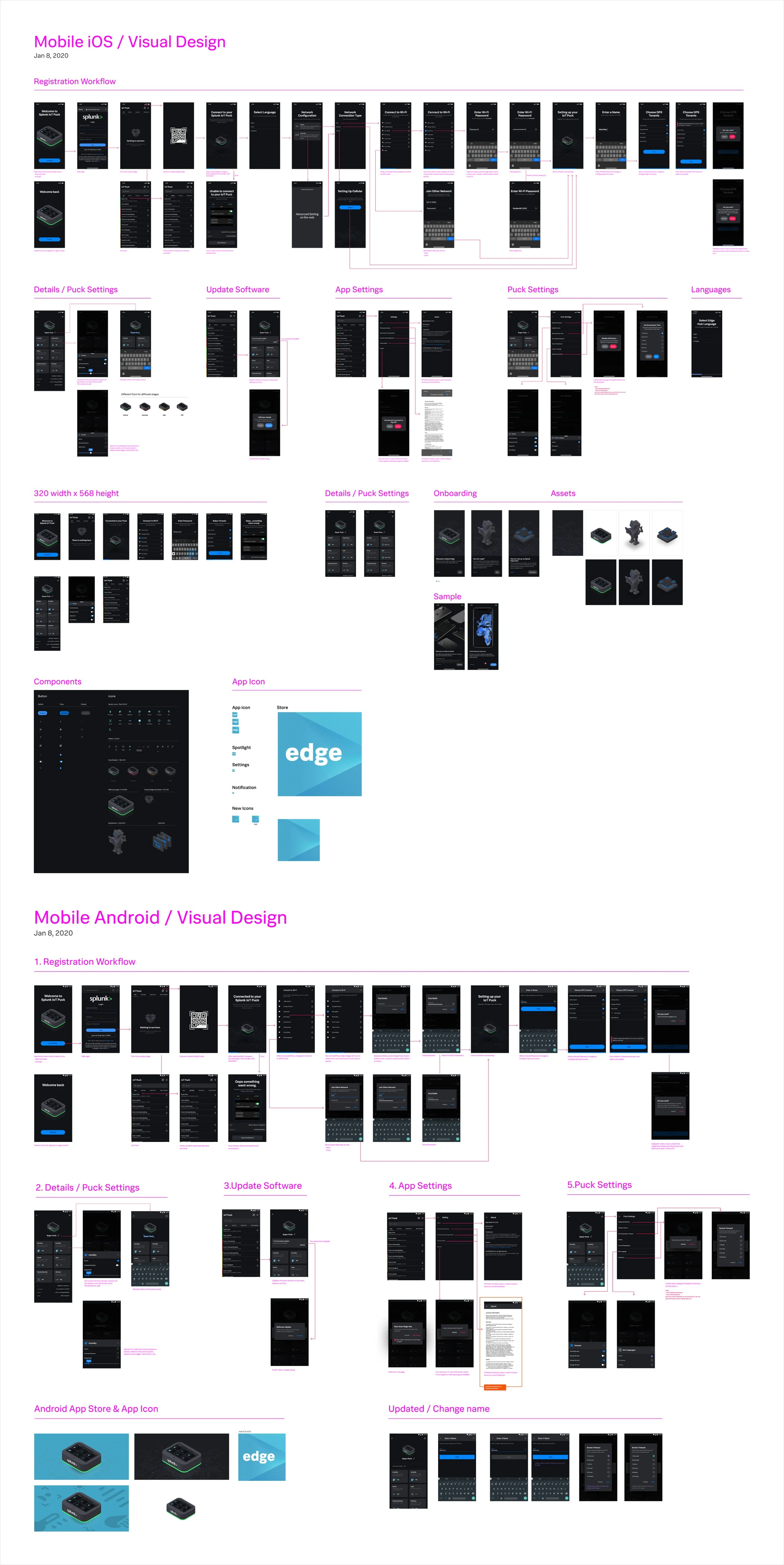
visual design
With the wireframes solidified, it was time to breathe life into the mobile app through visual design.
Sibling Design for Seamless Experience: I carefully carried over the look and feel of the IoT device, creating a sense of family resemblance between the two interfaces. This visual continuity reinforces brand identity and provides a seamless user experience across platforms.
System Components for Efficient Development: To ensure future maintainability and scalability, I leveraged system components as much as possible. This strategic approach simplifies development and maintenance, allowing the team to focus on core functionalities and enhancements.
Visual Harmony and User Delight: Beyond functionality, I crafted a visually appealing and user-friendly interface. I selected color palettes, typography styles, and worked with illustrator to create a cohesive and aesthetically pleasing experience that delights users.
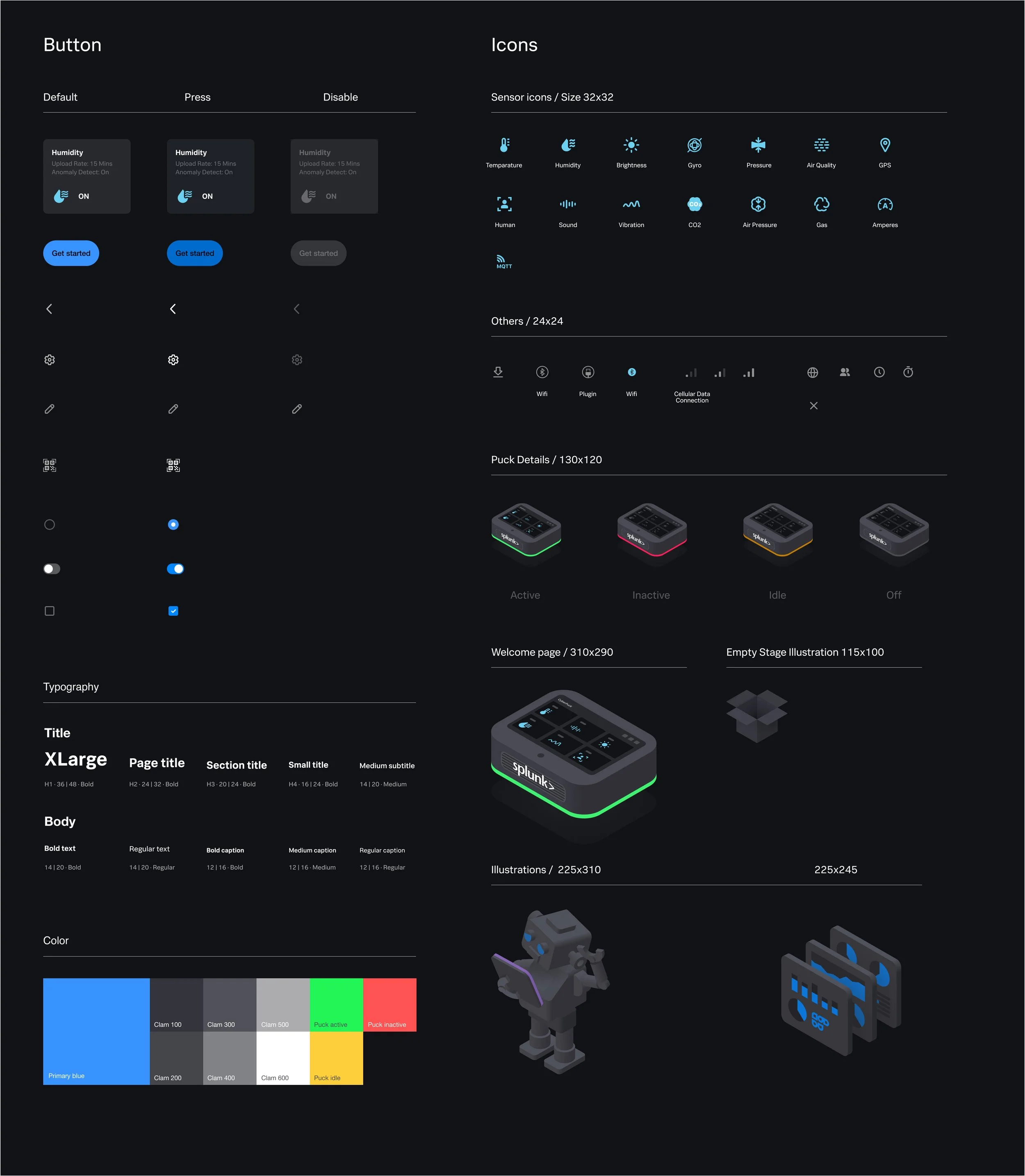
components
To ensure consistent design implementation and maintain a single source of truth, I created a comprehensive component sheet. This served as a central repository for all UI elements and their specifications,

Onboarding screens
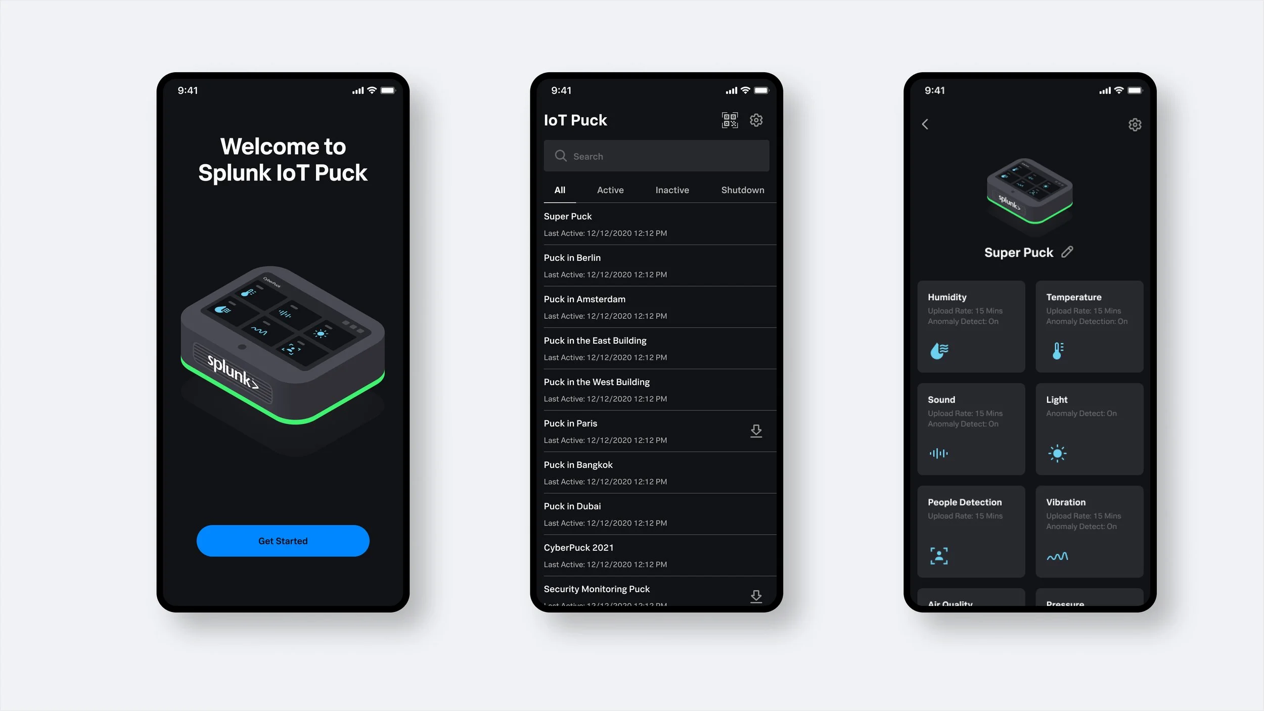
Welcome, List of device and device detail screens